Today for Animals
Proving that secondary research can lead to good conversion, despite budget constraints.
My role
UX/UI Designer
Timeline
12 months (January 2023 - January 2024)
Team size
Tech organization (VeganHacktivists)
Important note: This page only presents a summary of the project. Specific details are excluded to ensure the company’s privacy and to protect my work from potential plagiarism. The full case study/project brief can be made available at request. Thank you for understanding.
What is the goal of Today For Animals?
The volunteering app aims to increase volunteer engagement and involvement in the animal cause. It addresses the challenge of keeping volunteers motivated and active, by providing them with a fun, interactive and well-structured platform that offers them opportunities for meaningful tasks. The overall goal is to help volunteers achieve a sense of efficacy and fulfilment in their activism efforts.
A rocky start... vague ideas & a limited budget
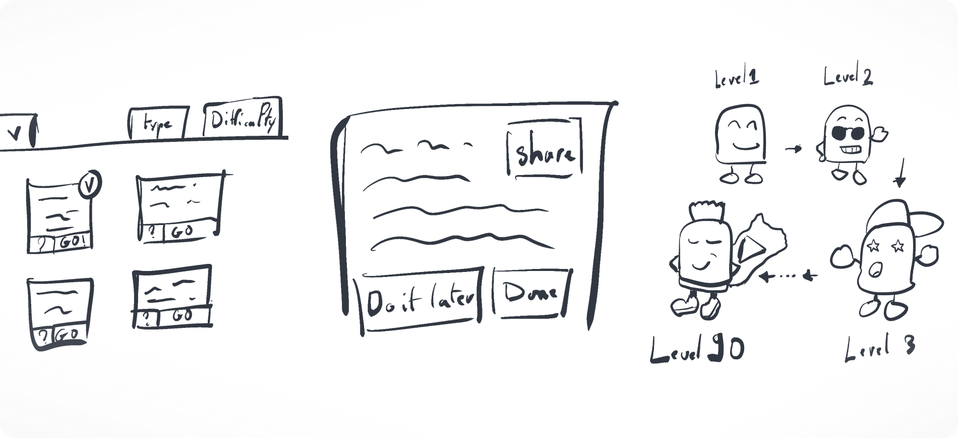
My team approached me with a basic idea and concept of the website/webapp and some sketches. The main target was to aid volunteers in becoming more consistent in their activism for animal well-fare.
Sketch exploring the main ideas and features.
Note: This is a recreated sketch due to privacy concerns.
As our budget and time constraints didn’t allow in-depth discovery, we chose a user persona who is constantly present in the activism and volunteerism space, especially in our area of volunteering work.
Who is our target profile?
Our target profile is someone who:
  • Is interested in helping the animal advocacy movement
  • Wants to make an impact and see the results of their effort
  • May not have a lot of spare time for volunteer work
  • Is new to volunteering within the field of animal advocacy
What are the users’ pain points?
Due to the above mentioned constraints regarding primary research, I decided to utilize secondary research to uncover the following pain points and needs:

  • Users - especially newcomers - struggle to initiate their activism journey. They don’t know “where to start”.
  • Existing users want to be more involved, but don’t know how.
  • Time constraints hinder potential volunteers from participating.
  • Users are unaware of the impact their volunteering can have.
  • Existing apps don’t sustain user motivation.
How can we solve these pain points?
Research stage 1: Volunteering aspect with focus on initiation, involvement, time constraints, and impact
We identified challenges faced by new and existing volunteers, focusing on starting their journey, maintaining involvement, managing time constraints, and recognizing their impact. Through secondary research, including literature reviews and competitive analysis, we gathered valuable insights. These informed our solutions, ensuring a more engaging, and impactful volunteer experience. Below are the solutions to the identified pain points:
New users don’t know where to start
Provide referral and invitation links to create a clear starting point while fostering a sense of community. Offer clear tasks for users to choose from, allowing them to start volunteering instantly.
Friend invitation illustrated using simple shapes and scores.
Users unsure about their involvement
Implement a helpful tutorial and support system with strong content and UX writing. Introduce game mechanics, like defining clear goals, giving instant feedback, and balancing task challenges.
Group cheering a person.
Time constraints limit participation
Offer time-restricted volunteering tasks and break larger projects into smaller, manageable chunks. Grade tasks by difficulty and time needed, and let users choose tasks at their own pace without deadlines.
Difficulty level selection.
Users are unaware of their impact
Promote the time logged volunteering by using minimum wage as a measurement to show the monetary value of their effort. Offer cash awards for accumulated tasks that users can donate to their favorite NGOs, reinforcing the impact of their volunteering.
Leveling up system illustrated.
After finding satisfactory solutions for the first 4 pain points, we turned to point 5. The issue being “Existing apps don’t sustain user motivation”, lead us to the concept of gamification, as a means to captivate users’ attention and keep them motivated. The following Research Stage 2 now involved researching how other products successfully use gamification.
How do other products realize gamification?
Research stage 2: Key mechanics, patterns and their relevance
Keys we observed in other products: Evolve around the fun, enjoyable, and user-friendly elements for both volunteers and charities. Attempt to build a community among users. Encourage users to take actions. Provide support to volunteers and organizations throughout their journey. These reoccurring patterns and elements were the most relevant for our specs:
Exploring dashboard layout
Utilizing a dashboard layout with interactive cards.
Multiple cards on a board illustrated.
Modals for detailed views
Modal pattern for detailed views, triggered when users interact with the cards, maintaining focus on the dashboard.
Basic wireframe of a modal.
Discovering user rankings
Ranking page, so long as it doesn’t compromise user engagement and motivation.
Leaderboard.
Unlocking achievement levels
“Leveling Up” system with evolving avatars, illustrating the Volunteers’ progress.
Leveling up system using diverse geometric shapes.
In addition to the patterns mentioned above, my research revealed further game mechanics that can enhance user experience and address our fifth pain point:
Apps don’t sustain user motivation
Use gamification elements like leaderboards and achievement rewards. Allow users to customize their avatars and earn badges and certifications for their CVs. Provide incentives for high achievers, like featuring them in blog posts, and enable social media sharing to boost self-esteem.
Various level up stats that can be seen on a profile.
From Research to Rejection: Features we chose to set aside
Although all of our researched solutions looked good on paper, some of them didn’t end up proving useful for our specs.
Forbidden icon next to the features that were set aside.
While the Tutorial, Community Support & Resources could theoretically have been implemented, our team lacked the necessary resources for their creation, testing, and maintenance.
Tutorial & Resources
Writing Tutorials and Resources require extensive and testing before implementation, demanding a larger team than we could provide. This constraint made it impractical for us to create these elements effectively.
Persona in the middle of a pile of books.
Community support
An active Support System needs continuous availability to manage a potentially large user base as we scale. Implementing such a system prematurely could have overwhelmed our limited resources, so we decided to postpone it.
Question mark in a bubble speech next to a persona with a headset microphone.
Regarding the Time Logging feature, two main issues emerged.
Time logging feature: anti-persona
I recognized an anti-persona, a user who may not adhere to logging time accurately, leading to potential abuses such as overstating their work time. This could affect the platform's credibility and fairness. Without verification, it could lead to manipulation by users and job posters, disrupting harmony and trust between them. Given our technical limitations, this solution was not viable.
2 halves of 2 different personas forming one. Left one with a green checkmark, right one with a red cross.
Time logging feature: task variety
A second issue we found was that a generic time logging feature wouldn’t be able to cater to the many different tasks the product offers (short-term + long-term), while keeping the cognitive load low for volunteers and job posters. A more sophisticated solution would need to be found before implementing this measure. As the Effort Measurement Metric is directly connected to time logging, we decided against implementing it, as well.
Type A timetable Versus type B timetable.
Lastly, regarding the Various Rewards system, while it showed positive results in other program, I identified two main issues with it too.
Rewards system: the other side of the coin
Rewards proved impractical for our current scope, due to our limited time budget. This feature would not only have increased our workload, but also the cognitive load on job posters and volunteer seekers.
Simple flowchart with a green checkmark Versus complex flowchart with a red cross.
Rewards system: less is more
As an excess of features can lead to feature fatigue, leading to a poor user experience, we acknowledged the need to balance the number of features to avoid a decrease in engagement and satisfaction.
Persona brainstorming, different icons representing features in the back.
From Research to Reality: Features we chose to implement
Several wireframings and meetings later, we decided to move forward with the following solutions:
Green checkmarks next to features that were implemented.
Referral and invitation
The "referral and invitation links" were chosen as they are easy to implement and have a proven track record in various applications. This feature fosters a sense of community and engagement, without posing any significant risk, regardless of whether rewards are attached or not.
Friend invitation illustrated using simple shapes and scores.
Chunking, autonomy
"Chunking tasks by difficulty" was favored for its straightforward implementation and maintenance. This feature allows users to choose tasks based on their skill level and availability, making the platform more accessible and user-friendly.
Difficulty level selection.
Gamification
Gamification elements, such as leaderboards, leveling up, customization, achievements, and badges offer a high degree of flexibility and control within implementation. Unlike other solutions that depend heavily on external participation, these gamification features can be effectively managed internally. They enhance user motivation and engagement, creating a more interactive, motivating and rewarding experience for volunteers.
Persona in front of a leaderboard.
End Result: The features in action
Integrating referral and invitation into our MVP.
Implementing task chunking and user autonomy. The design breaks down tasks into manageable pieces, providing users with options.
Gamification elements incorporated into the MVP - features like leaderboards, level progression, and customizable avatars that engage and motivate users.
How was the product received?
While detailed analytics weren’t available, early user feedback indicated positive reception with the look and concept of the webapp, as well as readily participation and motivation.
Instagram screenshot: "This is so awesome (heart emoji)" - "Happy to hear it! (heart emoji) Have you tried out completing an action already?" - "Yes!! 2 actions completed (heart emoji)"
Instagram screenshot: "I’m absolutely obsessed with this (smiley)"
Instagram screenshot: "I’ve just signed up and bagged some tasks this morning for the animals, only took a couple of minutes (heart emoji)"
Instagram screenshot: "This looks great (checkmark emoji)"
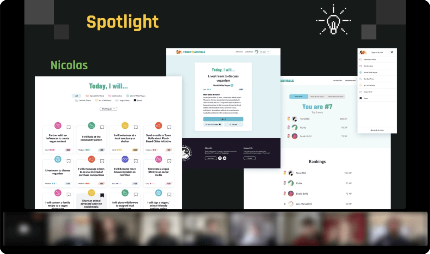
While the project is ongoing, here's a snippet of the positive feedback I personally received during our quarterly review meeting: "I just want to give a shout-out to Nicolas, because he's been so dedicated to Today For Animals, and he's been instrumental to the current design for this project. He's been putting forward a lot of creative ideas, and is always so eager to help, and so patient, so kind. Nicolas has actually been with us for over two years as of this July, he definitely deserves a shoutout for that."
Team video call, with blurred faces to keep members' anonymity. "Spotlight" is written with some project screens.
Take-aways & reflections
Secondary research can be an excellent tool to use when there’s budget constraints and no extensive primary research is possible. It is an often overlooked process that can yield useful insights and lead to impactful results.

I’m especially grateful for my new-found perspective towards gamification, which tends to have a bad reputation for overuse and problematic implementation. Secondary research helped me to broaden my understanding of gamification, its potential and its limits, allowing me to create a design for our product that exceeded the stakeholder’s expectations.

Thank you for taking the time to read through this case study.
Go back to the top.