Important note: This page presents a summary of the project. Specific
details are excluded to protect my work from potential
plagiarism. The full case study/project brief can be made
available.
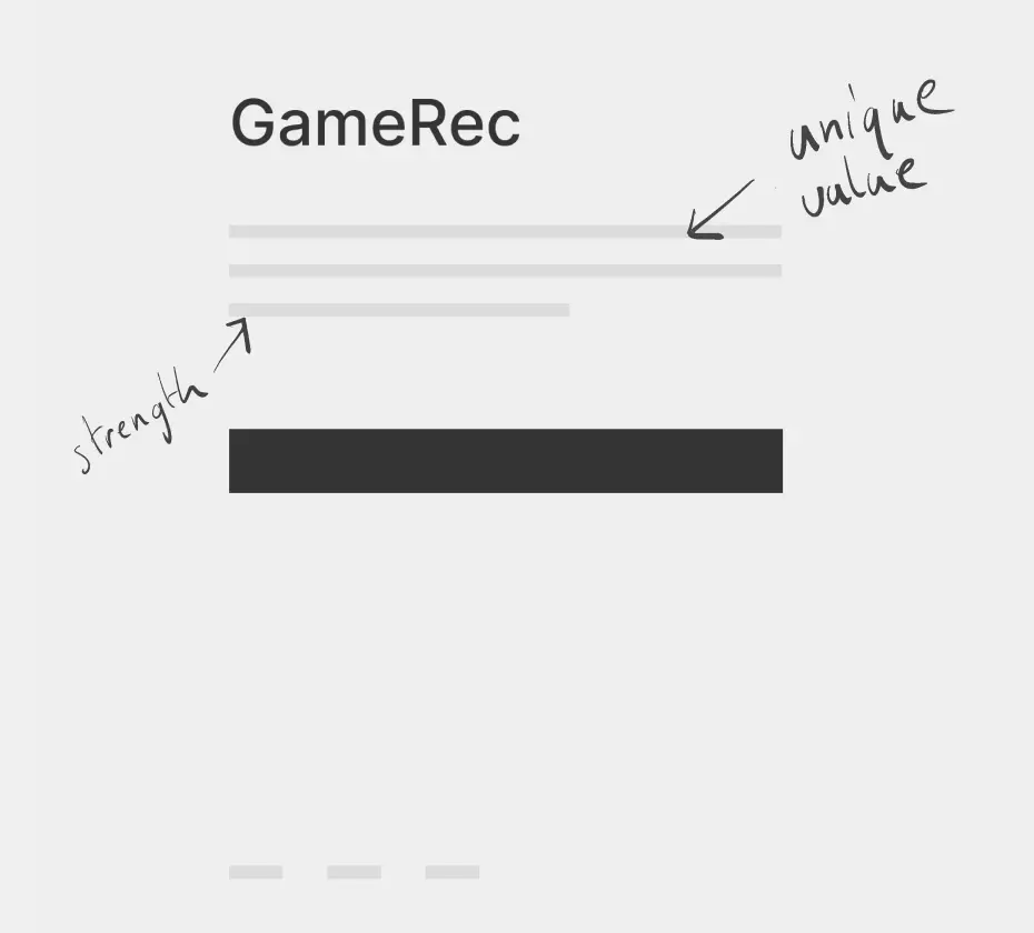
What is GameRec?
GameRec is a video game recommendation app providing users with
accurate and personalized game recommendations based on their
preferences and gaming level. The app addresses two main issues with
existing recommendation tools: inaccuracies in recommendations and
lack of support for different types of gamers.
What are our competitors lacking?
There’s little existing game recommendation engines, especially
ones that consider multiple platforms.
For regular and experienced gamers recommendations are mostly
popular games that they already know, there is a lack of niche
recommendations (for more “casual” gamers, however, these
mainstream recommendations can be useful, as they are less likely
to know about current popular games).
What will we do differently?
Our solution is twofold, focusing on both backend and frontend.
Thanks to user insights gathered through user research we aim to
identify key gaps and opportunities for improvement.
The backend
Provide an API that takes user input and delivers
recommendations using machine learning. Here my focus will
be scraping data, getting user input and help develop
recommendations that can be sent back out through the API.
The frontend
Provide an interface where users can input information that
helps drive the recommendations. The UI will also be the
place we present recommendations in an easily consumable
manner for any user type.
Meet the individuals we’re supporting
For the recruitment process, I ensured a balanced representation
across all experience levels and genders, ranging from amateur to
hardcore gamers. Having a large variety of users would allow us to
get a better overview - to understand where other recommendation
tools fail.
After completing the recruitment and
interview processes, I identified the following 5 personas.
Uncovering insights
Following a competitive audit to identify common patterns, I
developed these sketches and low-fidelity wireframes, observing
that:
High importance placed on the search bar and button across similar
apps and tools, both centered placement and large depiction.
Most game recommendation platforms didn’t provide copy explaining
the value of their tool.
Most platforms use the same method of generating recommendations:
an unnecessarily lengthy process of adding games and filtering the
result, resulting in detours that cause delay in reaching the user
goal.
Shaving off detours
Many competitors split the process of getting recommendations into
several sub-steps, by asking for excessive user input. While such
input is helpful as it assists the user, these steps greatly
increased the time to receive actual game suggestions. Such
detours also discouraged some users from continuing on the
website.
After noting those described detours, which
negatively impacted the user flow, the goal was to keep the user
journey as short as possible by avoiding such patterns. Hence, I
created an improved model. My goal was to find a balance between
assisting the user sufficiently, while also giving them a prompt
recommendation.
Control - Main mechanism
Initially, we followed a common pattern seen in many
recommendation tools, allowing users to input as many
games as they wanted. This resulted in a potentially
endless loop where users, without clear instructions, were
left wondering, 'Should I add more titles?' This
intentional lack of restrictions often led to confusion.
In the following sections, we will explore how we
addressed this issue.
Control - Chips and Home Page Restriction
This version has extra customization capabilities with
chips, which were added because other platforms allow
users to filter and view games by categories, genres.
However, I minimized the amount of filtering and kept the
chips to a minimum. Additionally, users can only start the
process from the home page, a pattern that we found on
other platforms and that we adopted.
Control - Onboarding and Loading Screens
Finally, the onboarding and loading screens give users
quick tips to fill transition times. These screens are
placed between actions, such as between inputting games
and receiving the recommended list. The reasoning behind
including them was based on early user interviews, in
which I thought users had mixed experiences with
recommendation tools and showed some confusion when asked
about some of our competitors.
Minor changes, major rewards
Main mechanism
During the early prototyping stage we reduced the number of
titles the user can input. The users’ repeated expression of
disapproval with the competition’s lengthy method of
generating recommendations made a shortening of the process
and avoidance of repetitive actions crucial to us (Hick’s
Law), while still allowing for sufficient accuracy.
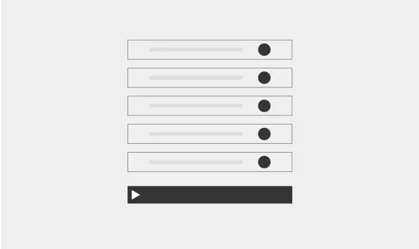
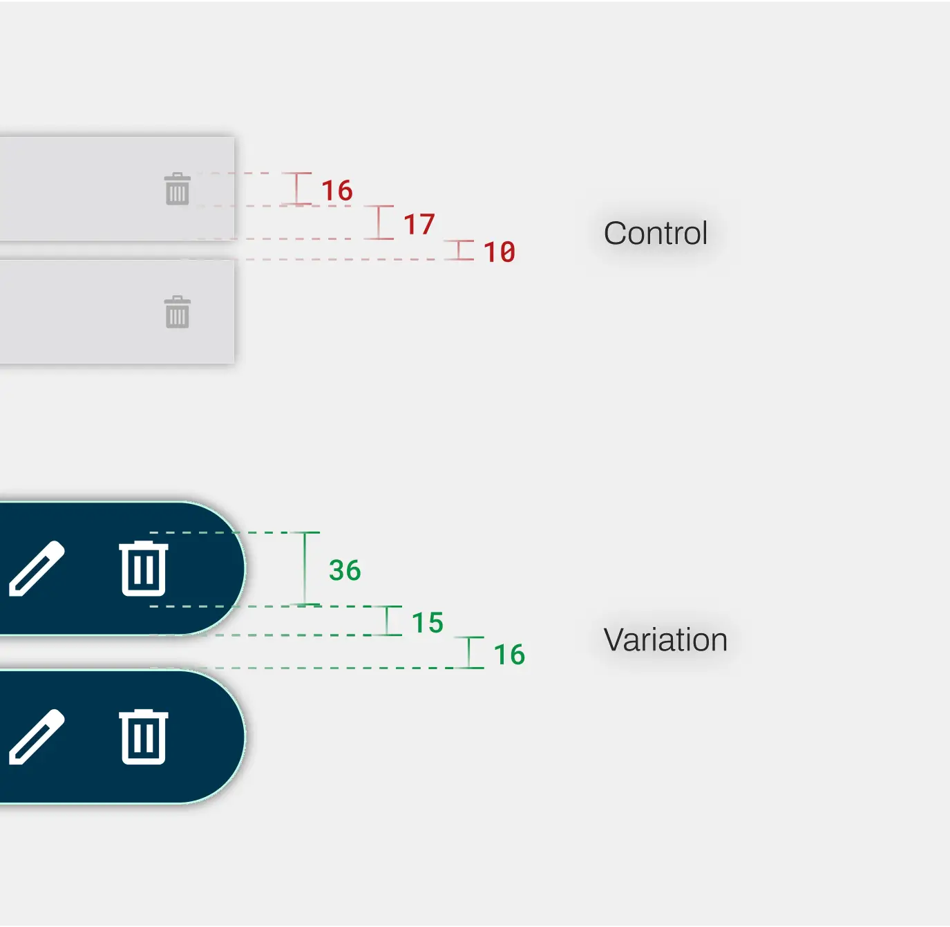
Control
This early iteration had no cap on user input. This
resulted in an unnecessary amount of titles, especially
when one of our initial goals was to optimize our API to
perform with fewer user inputs.
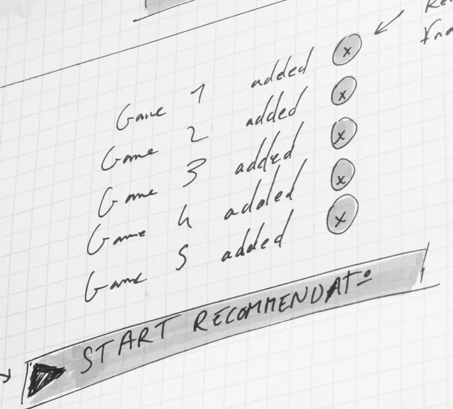
Variation
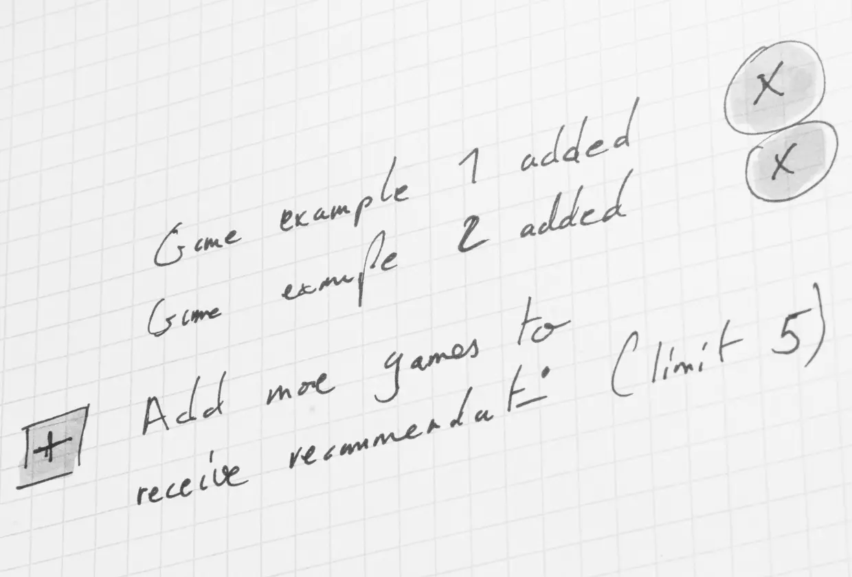
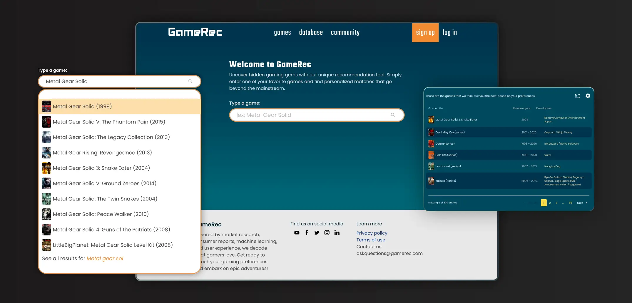
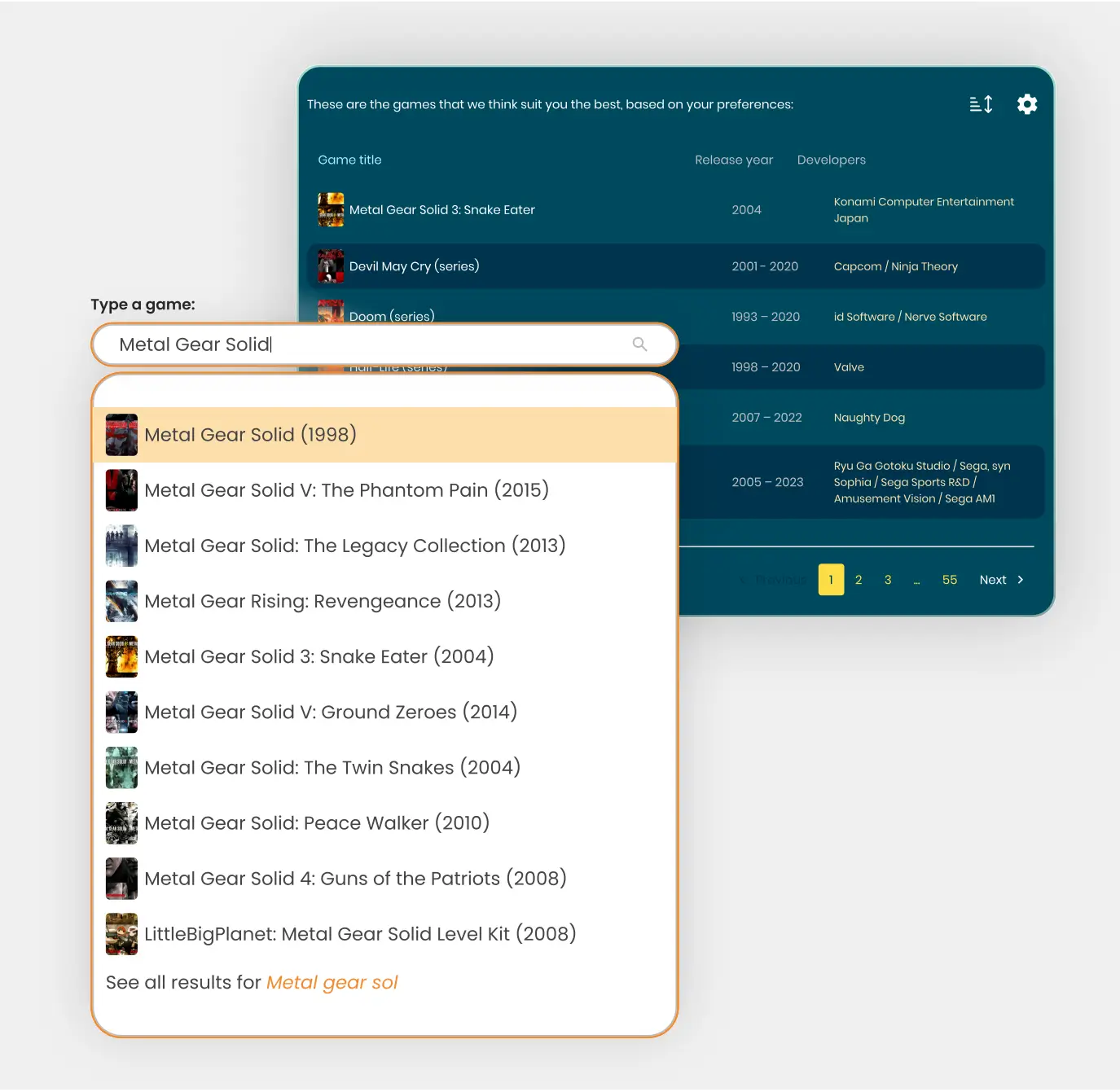
Fixed cap set at 5 inputs per recommendation. This
quick fix resolved the issue of users being caught in
an endless loop (fig 1.0), and it yielded the highest reward-to-effort
ratio.
Chips
User feedback indicated that too many filtering options could
be overwhelming. To address this, we focused on keeping the
filtering options simple and intuitive. This approach ensured
that users could easily find relevant recommendations without
feeling bombarded by too many choices.
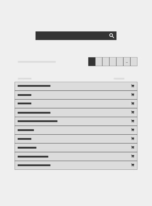
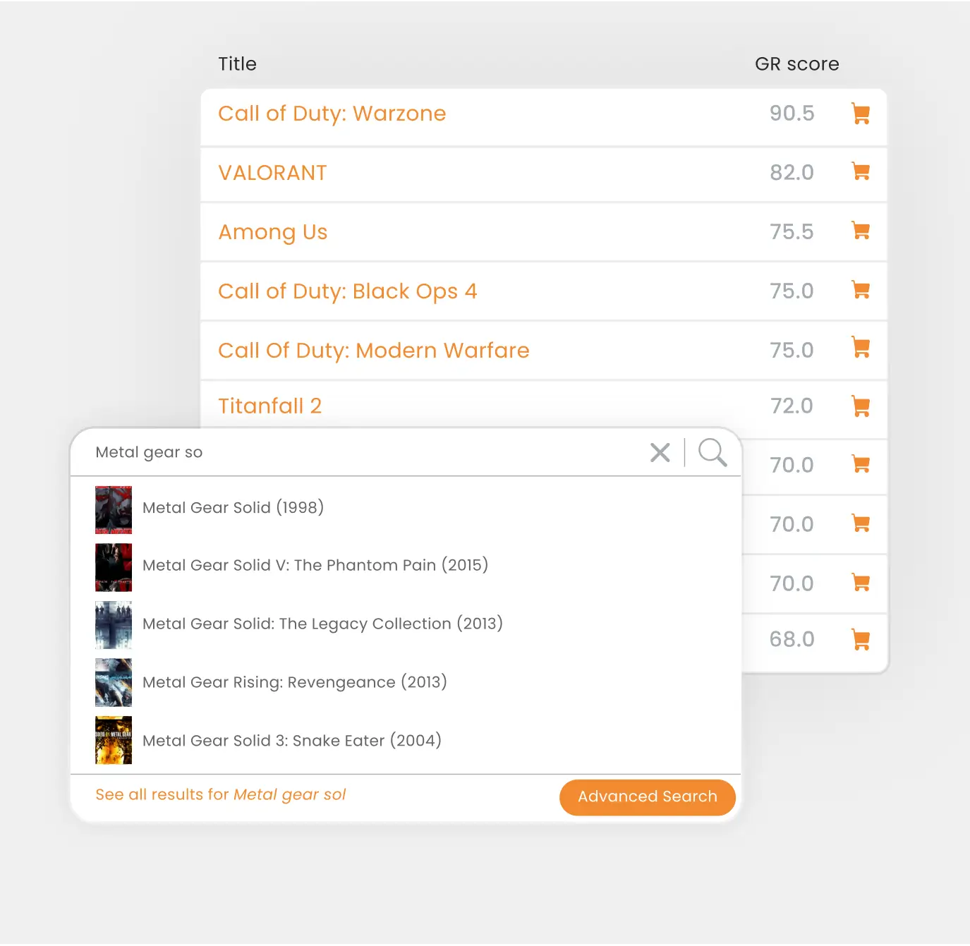
Control
In this early iteration, we implemented chips for
filtering and sorting recommended titles, following a
common pattern used by competitors (fig 2.1). Slight distinction however, I kept the amount of
filtering to a minimum.
Variation
Despite minimizing the filters, we eventually removed the
chips completely. While competitors' products feature
advanced filters, these can overwhelm users unfamiliar
with the titles. By eliminating these options, we reduced
both interaction and mental friction, aligning with our
goal of highlighting more niche titles.
Homepage restriction
Feedback revealed that restricting the recommendation process
to the home page was causing significant user frustration.
Users wanted more flexibility in how and when they could get
recommendations, without the hassle of restarting from the
beginning each time.
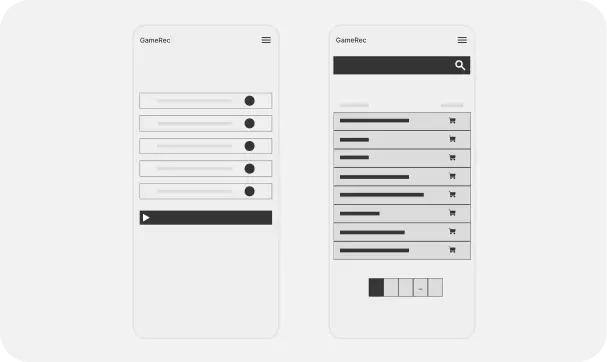
Control
Users could only start the process from the home page
like seen on other platforms (fig 2.2). This forced users to restart the entire process
each time they wanted to get recommendations.
Variation
We added the ability to get recommendations at different
stages during the recommendation flow. This change
addressed user frustration with having to restart from the
beginning and re-enter all titles. Switching a single
title without having to remove and re-enter all five
titles is now possible.
Onboarding and Loading Screens
Initial user testing highlighted that the onboarding and
loading screens were seen as unnecessary.
Control
This early iteration had unnecessary screens (fig 3.0), early user feedback showed high level of
frustration.
Variation
This new version has simplified steps by also removing the
onboarding and loading screens it provides a shortened
completion time. This iteration increased our ratings
across different user tests.
Control
Although removing the loading screens sped up the search
process and earned us good ratings in user tests, it
introduced a new issue: users were uncertain whether the
search process had started due to occasional API lags or
timeouts.
Variation
To address this, we added a small loading animation in a
container just below the search button as a compromise,
this was a cheaper and quicker way to hide how the system
couldn’t provide instant or near instant recommendations.
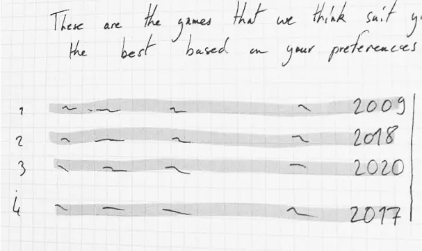
Let’s prove the positive impact in numbers!
Control
First medium/high fidelity prototype, used for all
initial interviews and tests.
Variation
High fidelity prototype after a round of usability
testing, interviews and two rounds of SUS.
Feedback
+ 150%
150% increase in the number of tasks easily completed in
variation compared to control during the TCR (or TSR).
+ 31%
While SUS has many limits, we saw a significant improvement
using it. First a 8% improvement (control → variation 1),
followed with a 31% improvement (variation 1 → variation 2).
+ 214%
Qualitative analysis showed a 214% increase in positive
quotes
- 76%
Qualitative analysis also showed a 76% decrease in negative
quotes
Moving closer to viability: shaping our style
Visual Design Impact: Survey Results
In the previous tests we had negative feedback regarding our
visual style and the lack of imagery across the platform. I
ran a survey to target these areas. Following all insights,
the following decisions were made to finalize our MVP:
Colors: using yellow and orange shades to evoke happiness
and entertainment. Using blue and green shades to evoke
calmness, peacefulness and comfort.
Fonts: Teko features angular designs reminiscent of classic
games predating the 128-bit console gaming systems era,
aiming to build trust with users. Paired with Poppins to
maintain a calm effect, these fonts, being open source and
curated by Google, ensure optimal performance and
accessibility.
Logo: Inspired by pixel art style and the ambiance of arcade
game venues to evoke a sense of nostalgia and reinforce
feelings of familiarity and comfort.
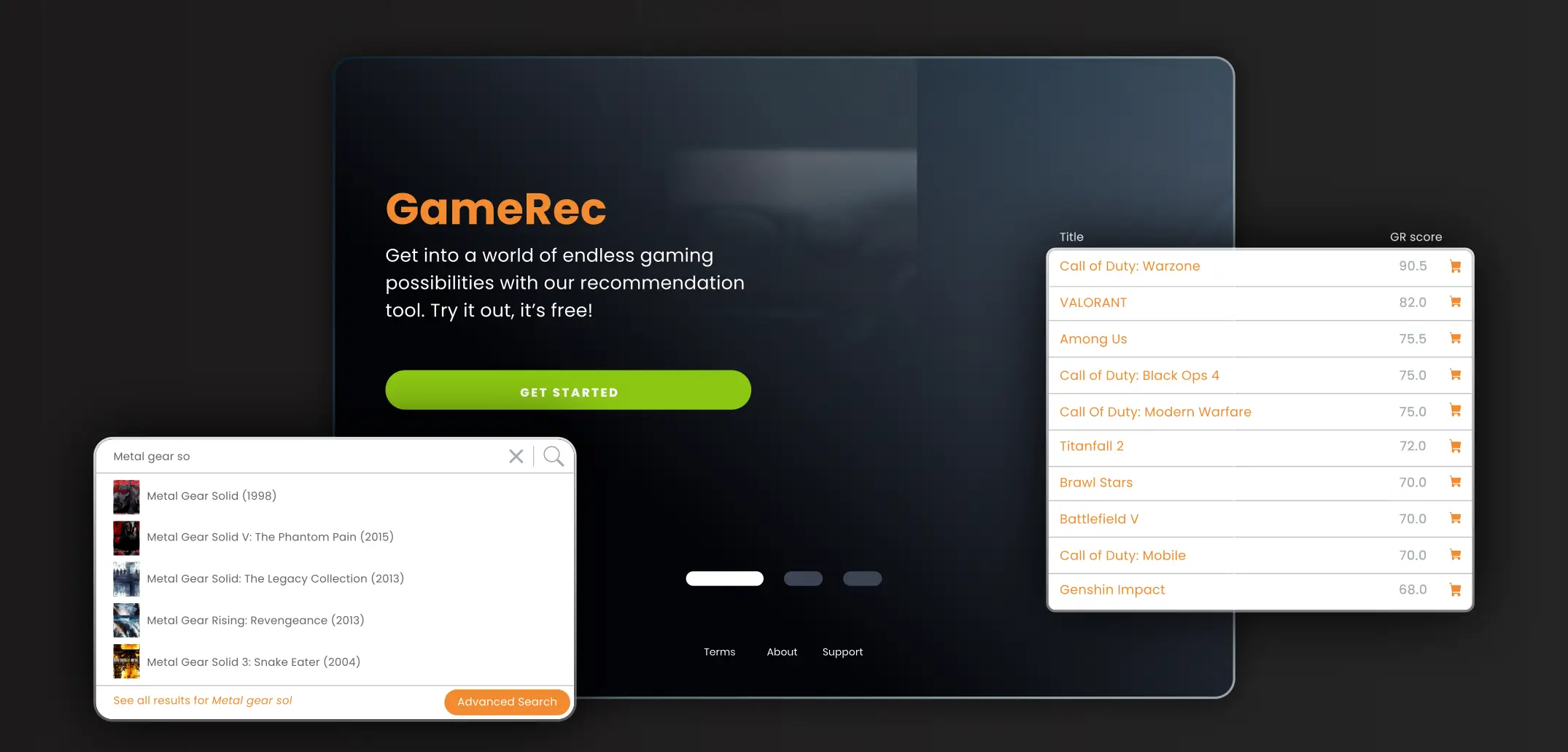
Control
Main feature appearance (first high fidelity prototype).
Variation
Our MVP’s appearance, crucial issues found during the
research cycle are fixed now.
+ 76%
We observed an 76% increase in positive responses.
- 66%
We noted a 66% decrease in negative responses.
Accessibility
Some small improvements (that competitors overlooked), which
lead to significant QoL improvements.
Contrast
WCAG AAA and WCAG AA contrast are achieved across the
web app.
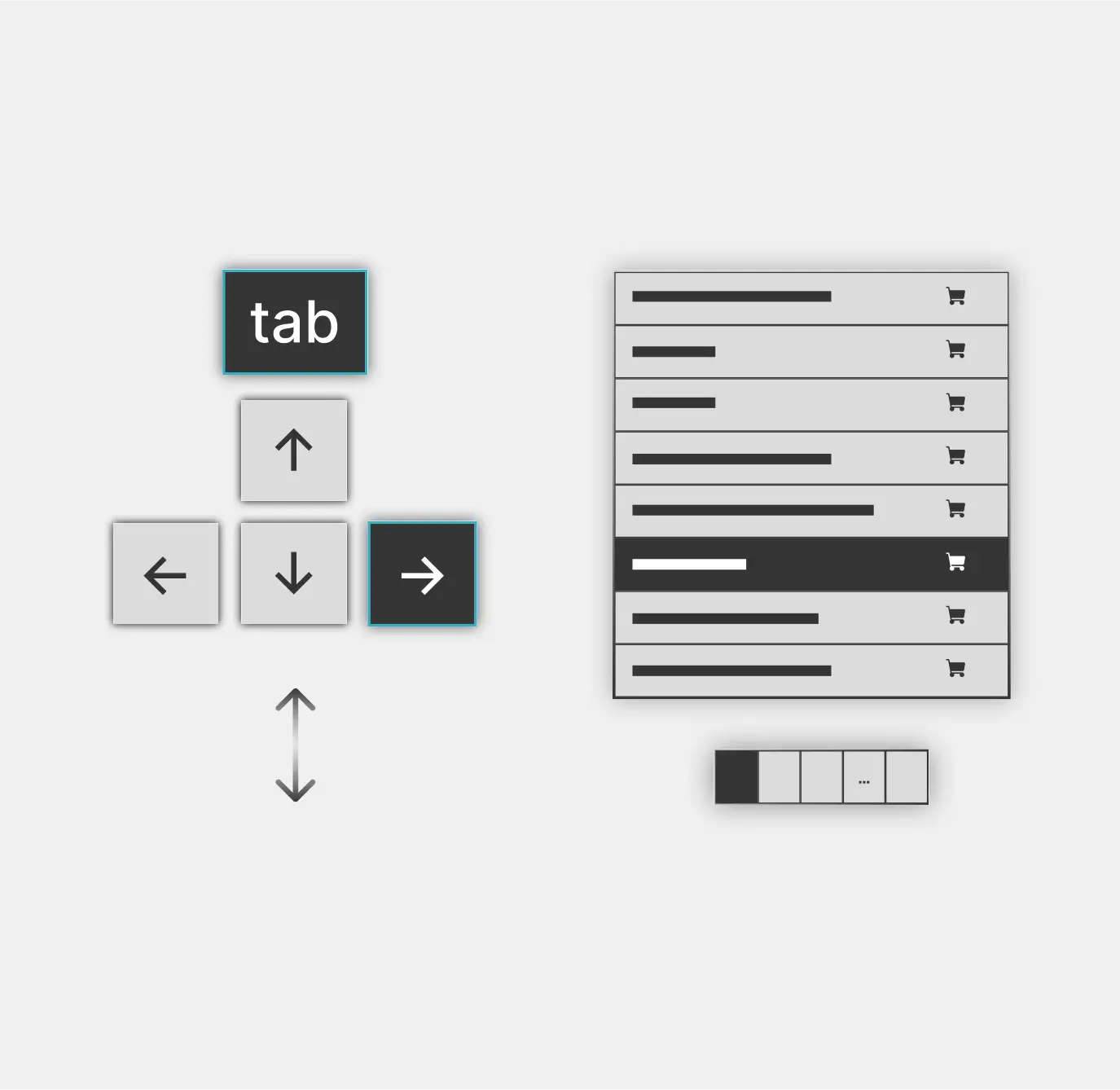
Keyboard navigation
Keyboard only and voice navigation are now possible.
Button clickability
Small spacing adjustments improved user interaction
while reducing user frustration.
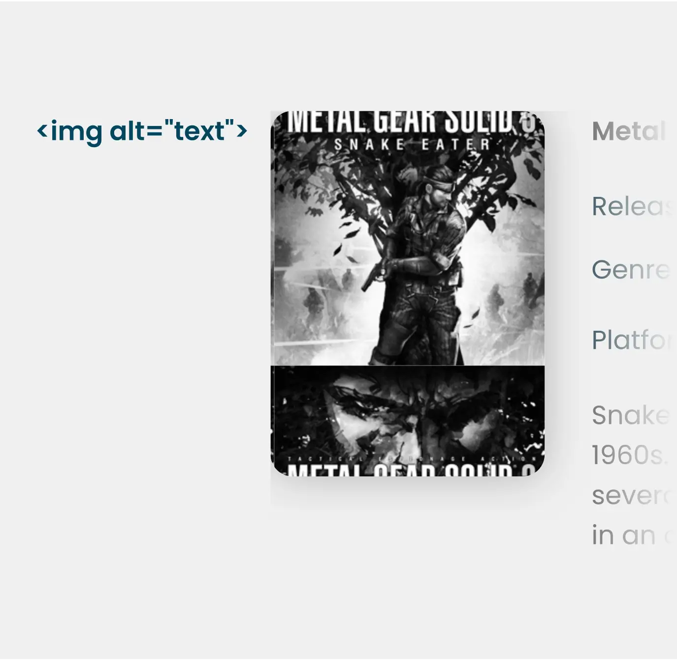
Alt text
Alt text was implemented as much as possible across the
interface.
The product in action
Allowing users to get recommendations from various sources,
eliminating the need to return to the home menu to start the
process.
Removing the onboarding reduced friction, making it easier
to jump right into using our product.
Making the recommendation process in our MVP quicker and
more accurate by reducing the number of inputs. Various
loading/splash screens were removed as well.
Full demo of how the recommendation tool works in just under
2 minutes. It shows how we reduced navigation to two clicks
(return → open) between games, eliminated the need for
external links, added a loading animation which masks small
time-outs and finally added more in-platform game details.
Reflecting on the process
By keeping it simple and listening closely to user feedback, we
managed to achieve measurable results without excessive API tweaks
or completely revamping the entire core mechanism.
This suggests that multiple game recommendation tools could be
easily improved, provided user testing is implemented.
While all recommendation tools have their strengths and
weaknesses, adding a feedback feature to validate the quality of
recommendations could improve their accuracy over time.
Considering that our testing and alterations were low-budget,
GameRec has potential for further improvements on a higher scale
of development.
What could have been done better?
The following areas could have been dealt with more
efficiently:
Competitive audit: More time could have been spent on analyzing
other features.
Underestimating rapid Iteration: I could have a created a bigger
variety of versions to test more of our ideas.
Post-deployment period: Due to our small team size and the
project's nature, we were unable to find a replacement for
one of our team members. This stopped our progress from
advancing to the next stage. We could have reached out to
contractors or alternative solutions, for hands-on support.